Hiring Posts
These are several hiring layouts I had to make, with different content for different purposes.
These are several hiring layouts I had to make, with different content for different purposes.
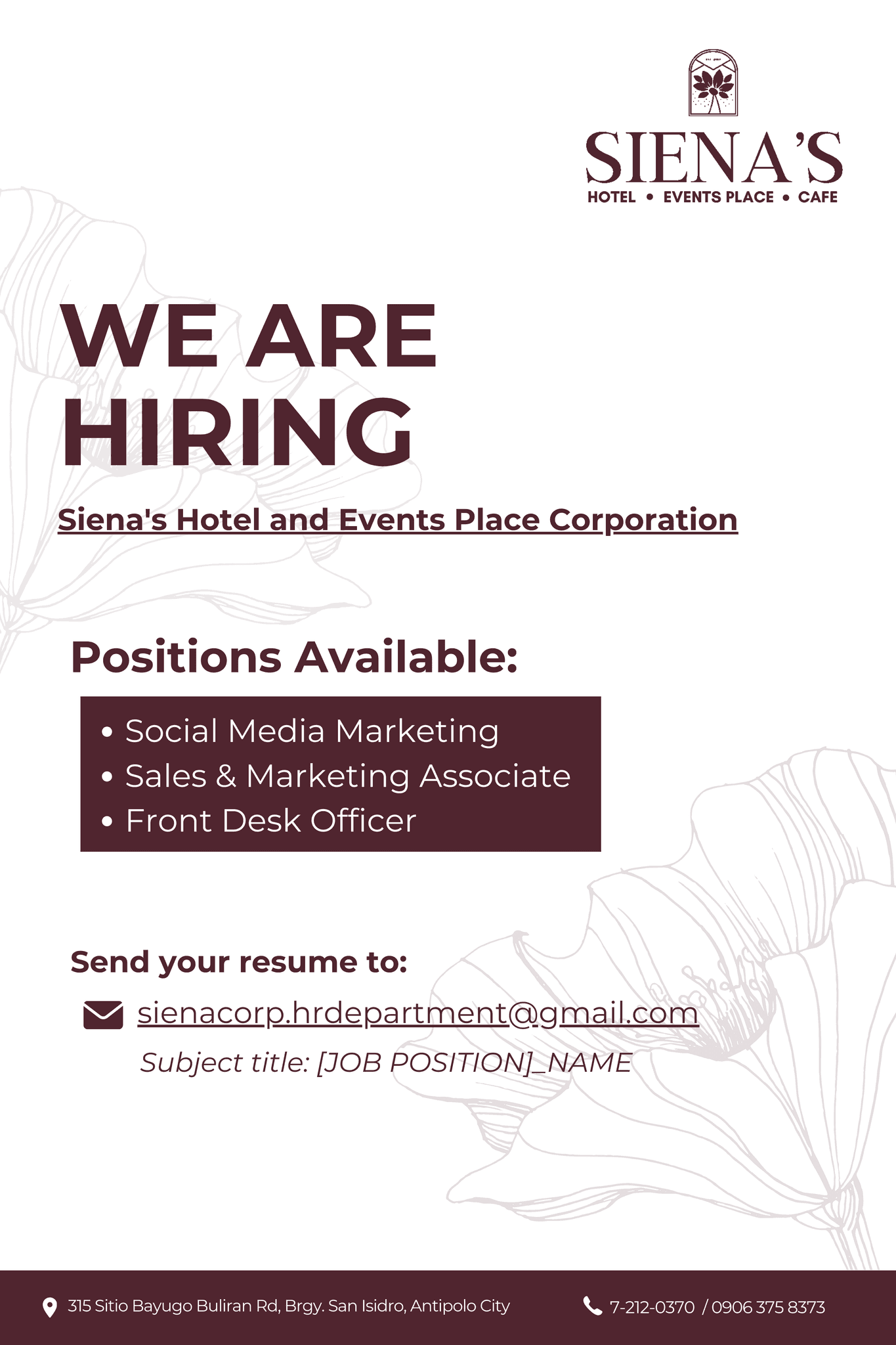
We Are Hiring
This layout was focused on informing the audience. Keeping the design clean highlighted the information written, which can also be good for physical posters.
This layout was focused on informing the audience. Keeping the design clean highlighted the information written, which can also be good for physical posters.
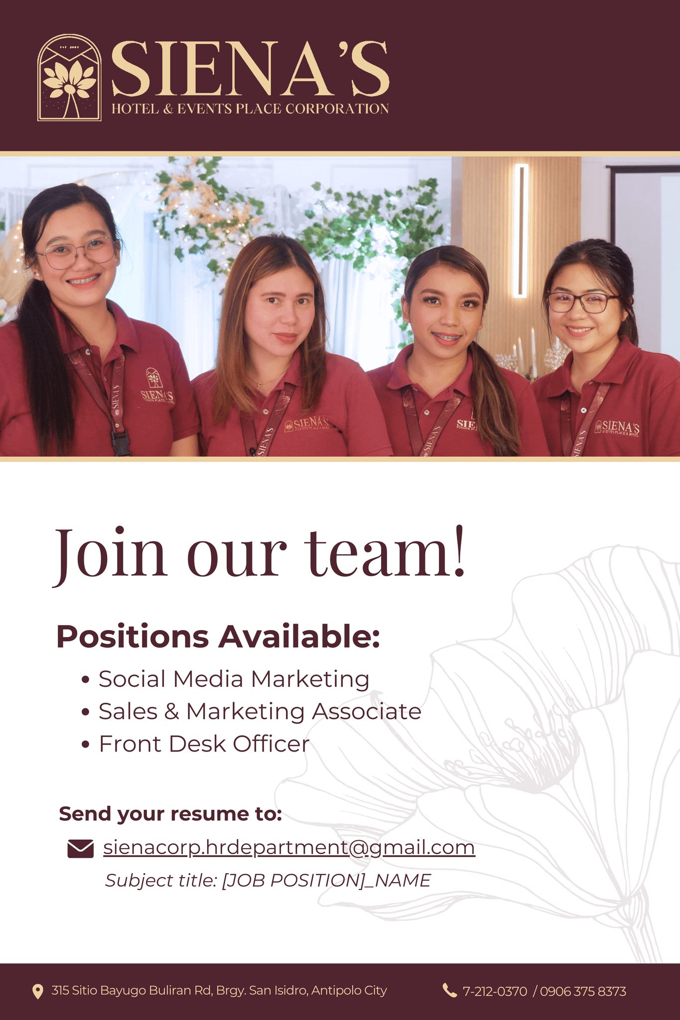
Join Our Team!
This layout was more aimed at inviting applicants to the people and culture of the company's workplace, hence choosing a photo of the employees.
This layout was more aimed at inviting applicants to the people and culture of the company's workplace, hence choosing a photo of the employees.
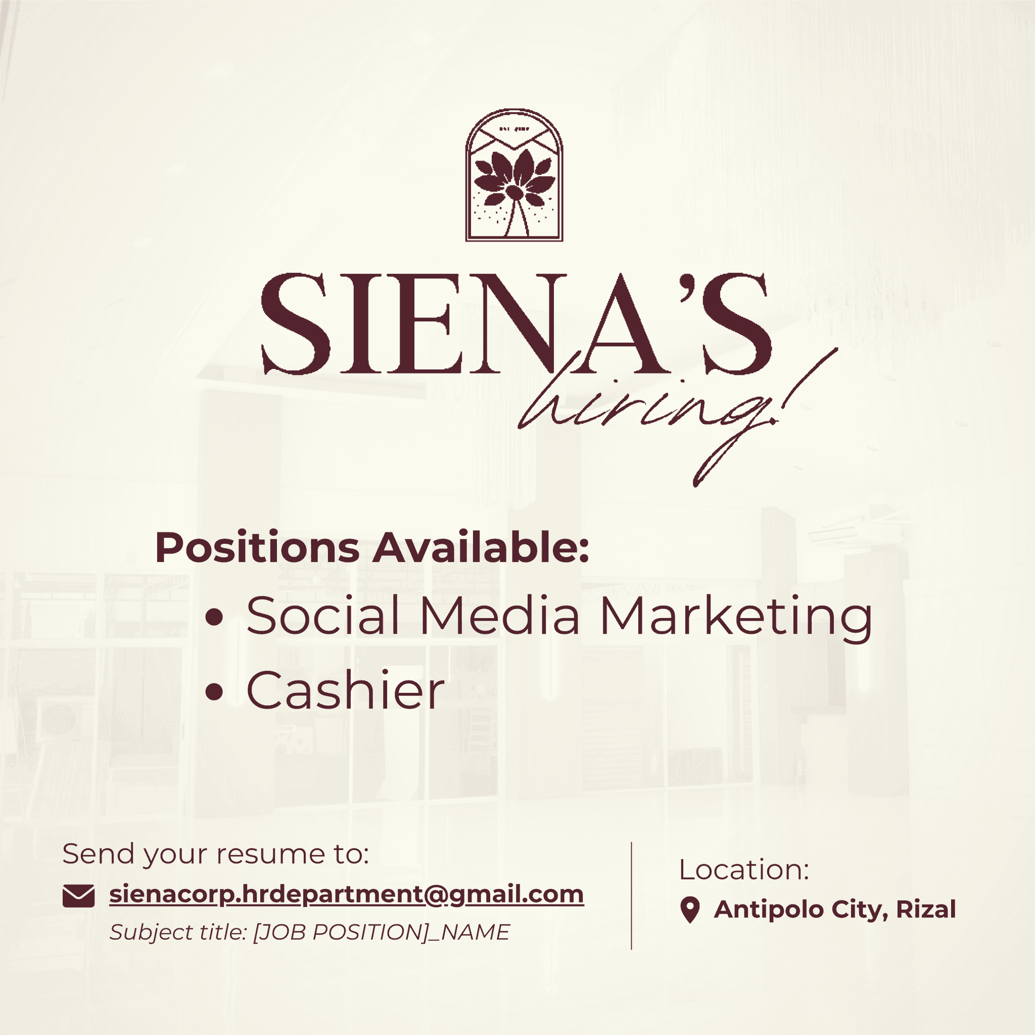
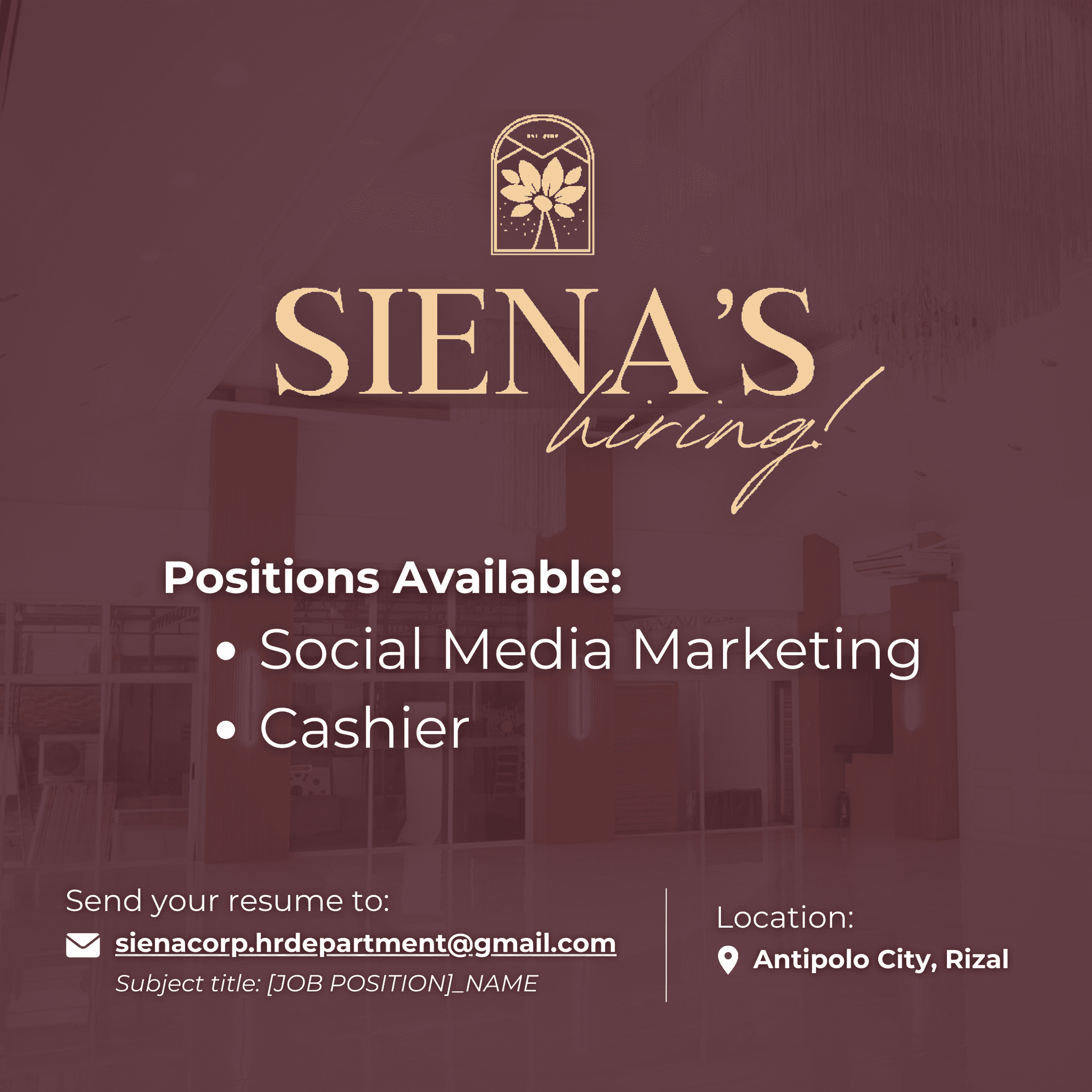
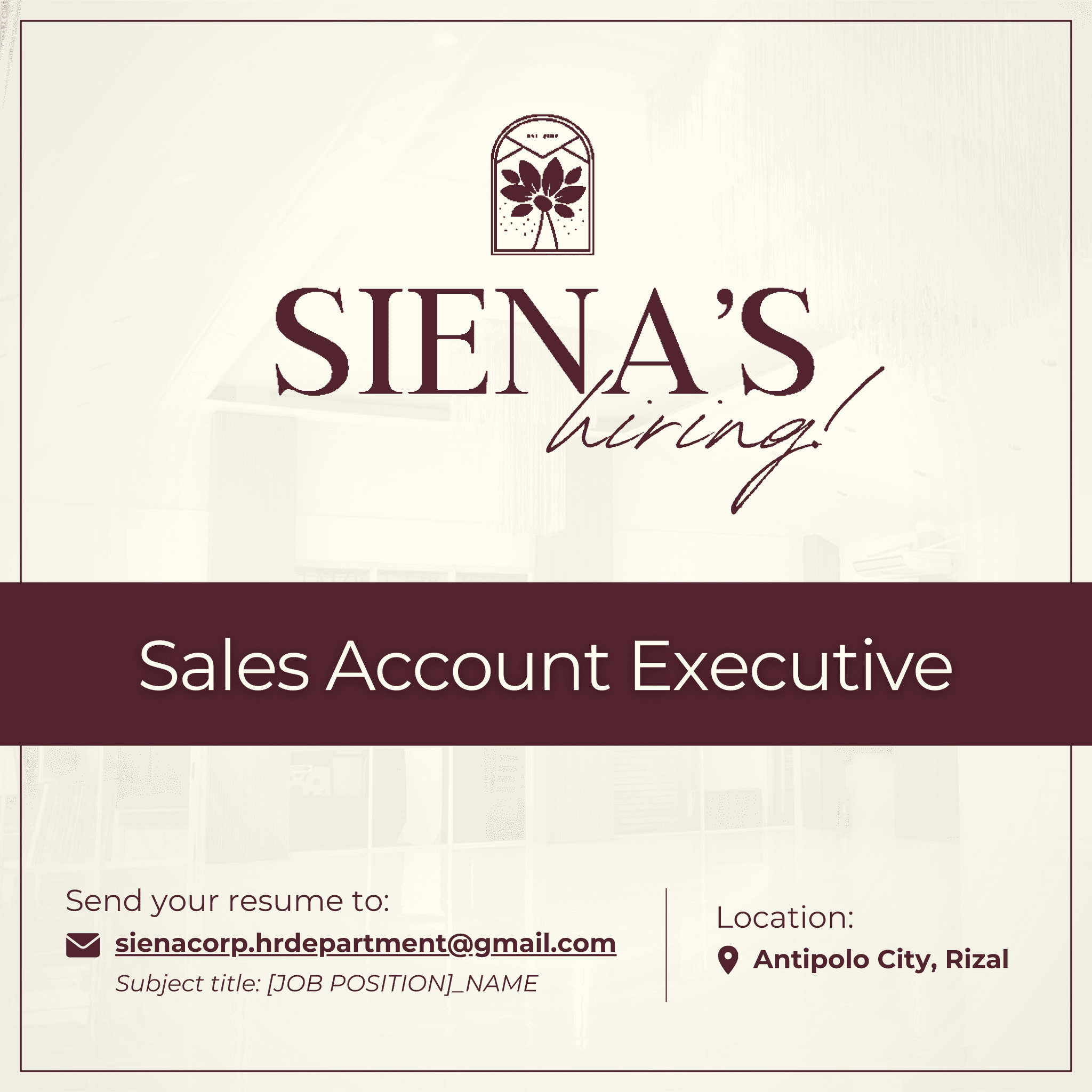
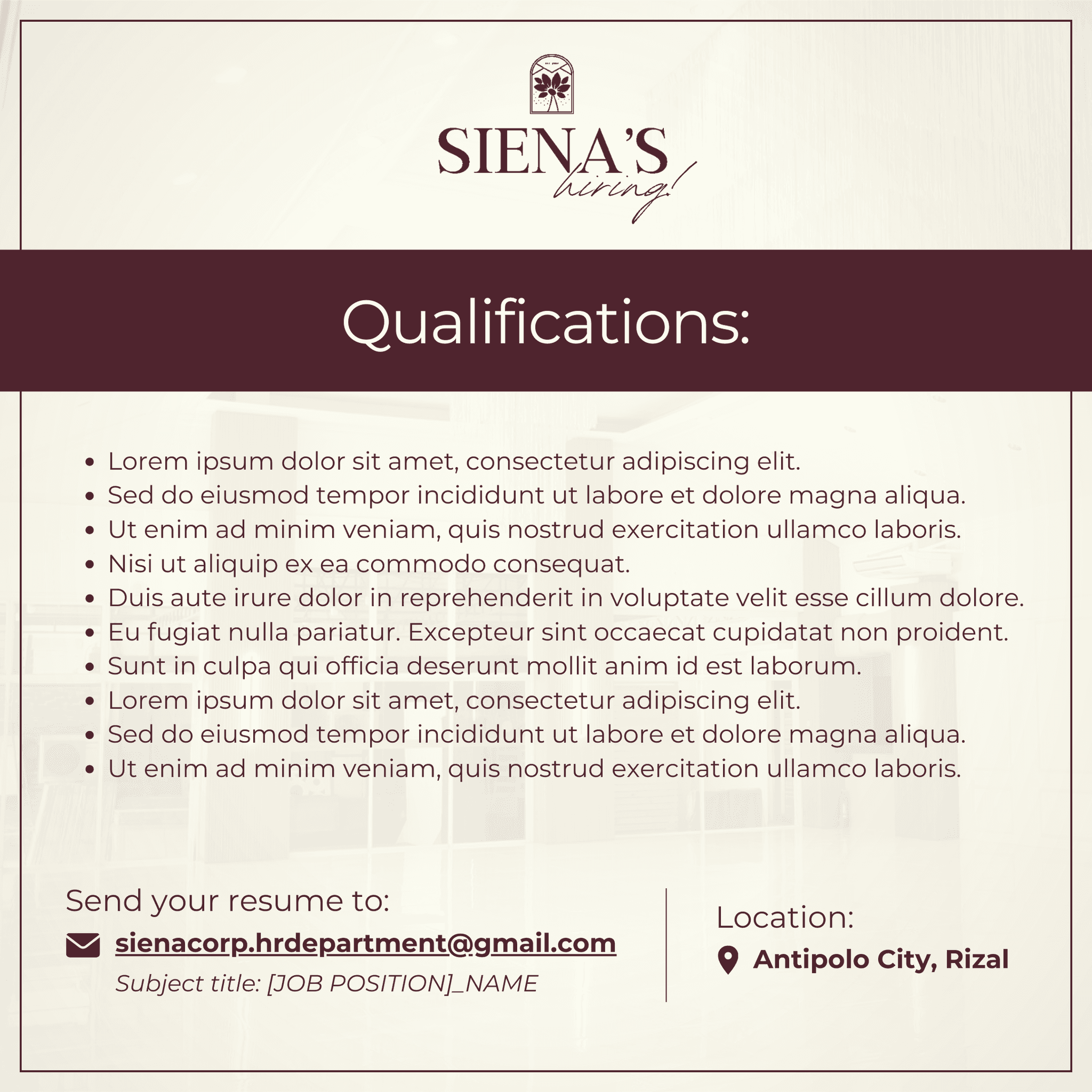
Siena's Hiring!
This layout was more for the short attention span on the internet, where there is a clear emphasis on the company name and positions needed, which I think are the top details that applicants look for, along with the application process and location of the company.
This layout was more for the short attention span on the internet, where there is a clear emphasis on the company name and positions needed, which I think are the top details that applicants look for, along with the application process and location of the company.

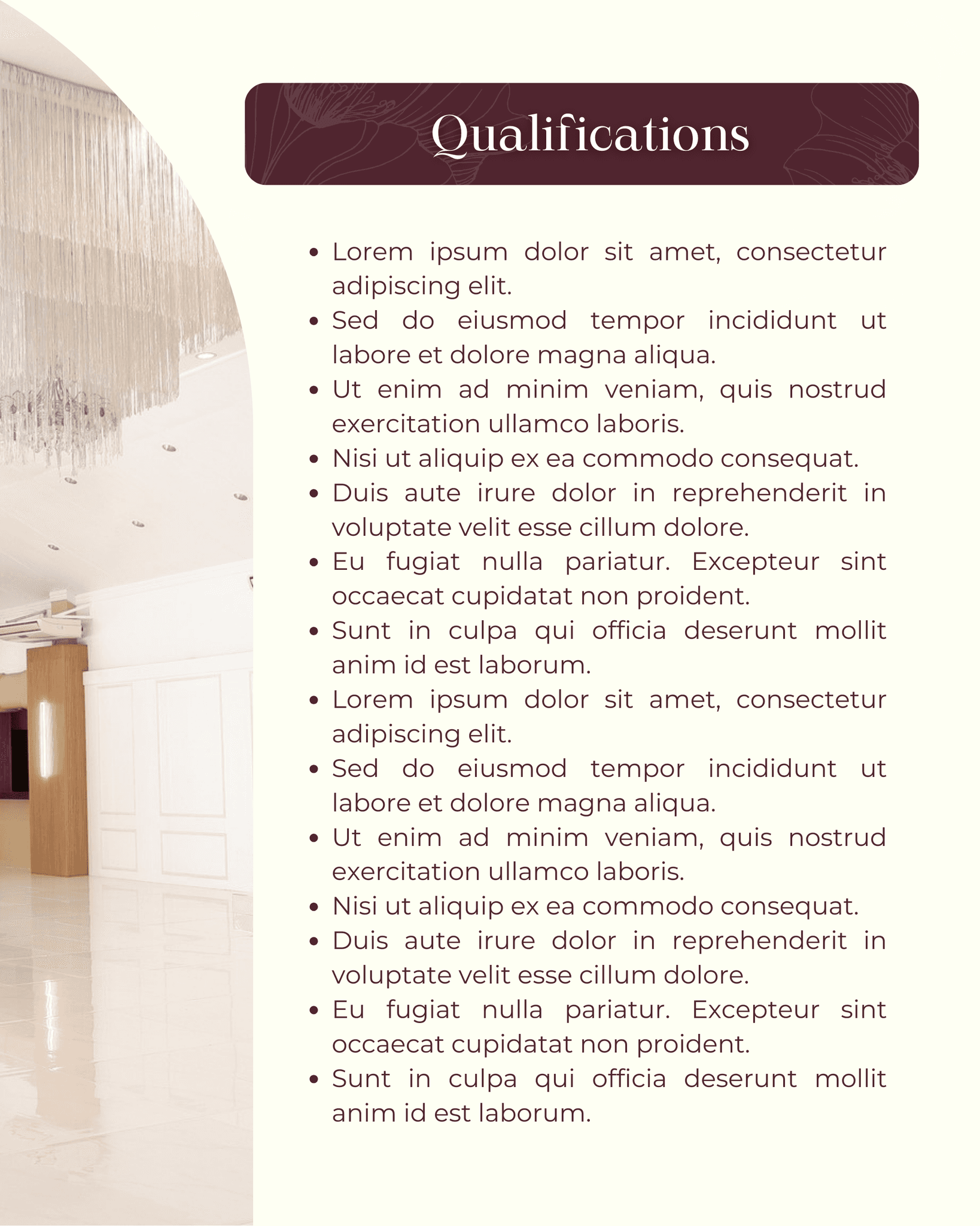
Position Hiring (Portrait)
This layout was also more information-driven, the difference being that it was more specific to the role. Though the goal here was to set an expectation for the audience as well, which is why there is a highlighted photo in the middle.
This layout was also more information-driven, the difference being that it was more specific to the role. Though the goal here was to set an expectation for the audience as well, which is why there is a highlighted photo in the middle.
Position Hiring (Square)
This layout was closely consistent with the previous layout on the short attention span. I would say this is my favorite out of all the layouts because the mix of photo background, text emphasis, and information was more cohesive and attractive.
This layout was closely consistent with the previous layout on the short attention span. I would say this is my favorite out of all the layouts because the mix of photo background, text emphasis, and information was more cohesive and attractive.
See more of my work!
Find the rest of my outputs in my main creative portfolio.
See more of my work!
Find the rest of my outputs in my main creative portfolio.
See more of my work!
Find the rest of my outputs in my main creative portfolio.
2024 eri's first intern portfolio
2024 eri's first intern portfolio
2024 eri's first intern portfolio